DAGOBERTO RODRIGUEZ interviewed by Jérôme Sans
What is the meaning of Los Emblemas series as a whole?
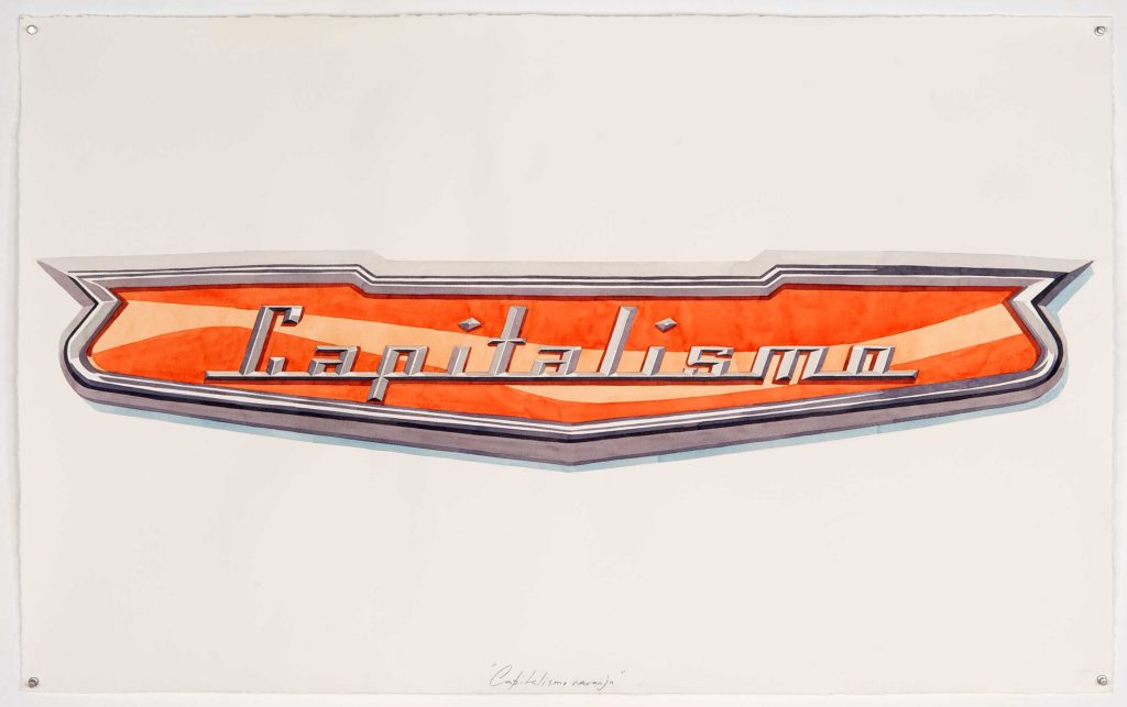
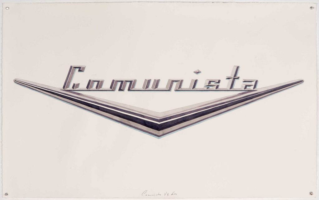
In conjunction, the emblems contain two completely different ways of seeing the world in one single object. These two points of view of reality come together in Cuba, but they are totally antagonistic. The first one (the American cars), is related to the growth of consumer products that have been sublimated to categories which are almost religious. The second one is a collection of words which have been most often spoken in Cuba, or by its revolution, over the past 60 years.
How long did you work on this project, how did you proceed?
The project began two years ago, with the death of Fidel. Western newspapers had their eye on Cuba again. The majority of his speeches were published online, so I revisited them in order to find a hierarchy within the words. The words that Fidel said most frequently are the same words that the revolution has used most in political propaganda. The whole staging of the “revolutionary gospel” has had a mistaken typography based on the typography “Impact”, which is the most used in Cuban media. However, if we are going to be consistent with the time in which Cuban revolutionary philosophy was crystalized, we would have to borrow from other sources that were more popular at the time, such as the Art Deco typography of North American cars.
Can you explain the relationship between art deco style and Cuba? The art deco style comes directly from France. The Americans then intensively appropriated this iconic style. And finally, the art deco style has been assimilated by Cuban culture, while many French we represent in Cuba in those years. Why did you choose to take inspiration from the art deco style for your typography and can you explain this progressive assimilation of a distinctive style in such different cultures and contexts?
Art Deco and Art Nouveau arrived late to Cuba, such as the Bacardi building, 1930. At the time, Cuba was in the midst of a revolution against the dictator Machado. For the first time, a united front was created that brought together the Left and the Communists. The rise and development of Art Deco and Art Nouveau in Cuban culture coincided with the spread of leftist ideas in Cuba. One must keep in mind that in the year 1940, a new constitution was formed for the republic and the Communist party (PSP) was legalized. This set of ideas which helped shape Cuban Socialism was formed in a period of national Art Deco and Art Nouveau postulates, which is the typography of North American cars at the end of 1940-1959.
How do you conceive the coherence of this series facing all of your work? To which works do you connect it in particular?
This series stems from an interest in the language of consumer products; the idea that any object is a vessel of a message that goes further than just its use. Our past work has always been very object-based, with text playing a background role. The text in this in case however, constitutes 50% of the meaning of the work.
How did you come to this selection of 12 slogans, from what source of information precisely?
The revolution has many other words. I only chose the 12 words that Fidel used most to give the project a biblical connotation; that of the 12 apostles who spread the word of Jesus. The revolution used this theme a lot after the first battle with the government of Batista, when only 12 combatants were left next to Fidel in the mountains.
Can you list these twelve words in the order of the hierarchy you have made?
1. People
2. Revolution
3. Democracy
4. Worm
5. Enemy
6. Injustice
7. Betrayal
8. We will defeat
9. Homeland or death
10. Counterevolution
11. Liberty
12. Work
Can you explain more precisely how do you proceed to make this hierarchy, with which kind of historic sources? Is it an exact process or more an interpretation?
A Cuban newspaper conducted a study on the words most used by Fidel in his speeches from 1958 until 2008. The word most spoken by Fidel in all of his discourses was the word “People”. I selected the 12 primary words, however there were many more.
Why did you choose the number 12 for the number of sentences and slogans most often spoken of the Cuban revolution?
The number 12 has a biblical significance: it was the 12 apostles that disseminated Christianity. In the “revolutionary epic” the number 12 is important as there were 12 combatants who survived the first combat against the dictatorship of Batista in the “Alegria de Pio” 5/Dec/1956 battle.
What is your relationship to these expressions, how do you interpret them? What do they express as a whole?
Cuba is not a rich country; the Cuban revolution was not in a country with large economic resources. The Cuban revolution was made, and continues to be carried out, with words. Words have historically been the revolutionary active principle. Those words spoken by its most important leaders have changed the course of developments in Cuba, they have decided the politics and they have marked the lives of Cubans during all these years. Cubans have a special relationship with the “words of the revolution”, because not only do they carry a message of identity, but they also constitute a moral guide which society supposedly runs on.
Why did you choose the car brand model to translate these slogans? How do you connect these two elements in your work?
The car models that were selected range from the end of the 40s until late 1959. The Castro regime is a conjunction of leftist ideas mixed with nationalism. These ideas started forming in this same period of time. My work is related to artisanal work as a symbolic source of value. The cars fabricated during this period, although they were fruits of a great industrial process, somewhat retain a sense of being “unique pieces”.
Do you consider it more as sculptural or as graphic work?
The emblems are more graphic works.
How do you explain that Cuba is the last country fascinated by this type of car of the 50s, true icons of America’s consumption society, even though the relations between Cuba and the United States have long been very stormy? They come from the United States but Cubans cannot get rid of them as much as they are intimate with these objects.
This is the great paradox of this project: an authentically North American product that survived in an ideologically hostile and anti-North-American world. More than that, North American cars in Cuba are more typically Cuban than the artisan is Mexican for Mexico. The Cuban revolution did not provide a defined aesthetic identity. What occurred in Eastern Europe did not transpire in Cuba: where Socialist Realism filled the museums and plazas. The case of the North American cars is simply a visual error of the revolution. A conversation about North American cars in Cuba is always a conversation about freedom.
Does the car still represent the revolution in Cuba today?
Yankee cars represent Cuba in that Cuba’s social project is delayed and impossible, both in time and technologically, it is almost a failed utopia. These cars were never nationalized like other property expropriated by the revolution. Cuba stopped importing American cars in the early 60’s. During the revolution the majority of cars came from the Soviet Union, but these socialist cars could not be sold or purchased in the same way as antique North American cars. These vintage cars therefore turned into a refuge from the free enterprise and the free market. Vintage cars became an expression of individualism in a collectivist country.
Why car represent freedom in a country where you are not allowed to circulate freely outside?
American cars are the last stronghold of privae property in Cuba. For years they could be sold and bought, and also reformed. Having a vintage car in Cuba is like having a piece of freedom.
Cars are normally for the West, like bubble for individuals and their relatives, while in Cuba, cars like taxis are collective. Can you explain this contradiction?
Although they are collective cars, in Cuba American cars are still an expression of individualism.
What fascinates you so much in these cars? They are flamboyant, pampered, customized.They seem to be really the emblem of Cuba and at the same time they relate their relationship with the outside world. Does not their presence reflect a part of archaeology of a past world?
The most fascinating thing about these cars is that they suggest a lifestyle where the past is part of the present. The emblems project will also include furniture and objects such as refrigerators. In a general sense, these recreate the atmosphere of past-present that Cuba has been living in over the past 60 years. It is an archaeological work; however, the slogans and cars also define Cuba’s present.
These cars have gone through so many DIY, repair and transformation phases that they no longer match the original version. Do you think we can consider that they have becomes imulacra of the original model?
Not really. The biggest transformations to American cars occurred in the engines, keeping the rest of the car intact. In Cuba there is a whole industry dedicated to recycling modern engines in order to use them on vintage North American chassis. However, these interventions are not as invasive as one would think. Generally, the owners of North American cars practice “reconstructive archeology” with a standard that is very close to the original.
Objects are eternal in Cuba, since the West doesn’t exist, objects have no limits of life. There are always remixed. Do you think it is a model of ecology to fight against consumerism and planned obsolescence?
Consumerism does not exist in Cuba in the same way that we are used to seeing in Europe. In Cuba, we have recycling and it is common for someone young to be fascinated by a vintage North American car with the technology of a Toyota. The interesting thing about this is that an idea which is completely novel and modern looks out of place and contaminated. At the same time, lack of development has obligated us to establish some different parameters which could also be valid and “modern”, very close to the parameters of the recycling of Western modernity. For example, in Europe it is increasingly unpopular to use gasoline cars because it contaminates the environment.
These cars are always customized, and tinkered. In your works, you often hijack and transform things. Is that why you have retained this mode of artistic expression?
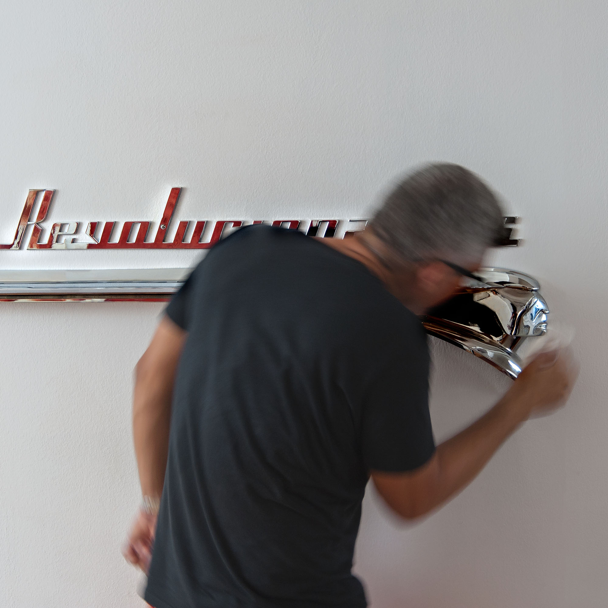
Yes, the emblems are also customized. They have all been fabricated from zero based on archives, using 3D printers. They all measure 70cm, the originals are slightly smaller.
Can you tell us about this work and its relation to the culture of the city, to the urban world?
The project is related to the city in terms of recycling. The process of symbolic recycling that an artist performs is a daily process of life in Cuba. It should be highlighted that Cuba is not at all a country with a consumer culture. On the contrary, we have an extensive culture of recycling, all objects are recycled. The lifetime of anything in Cuba is eternal, objects are repurposed constantly, even buildings.
How would you like to present the piece as a whole? Have you imagined scenography?
As I said before, the project mostly includes furniture and objects from daily life such as refrigerators etc. It is a great scenography where repurposed objects are mixed with the philosophies of the revolution.
How did you proceed to make this series? You drew the emblems and then you made them realize with a specialized craftsman? Have you collaborated with other people?
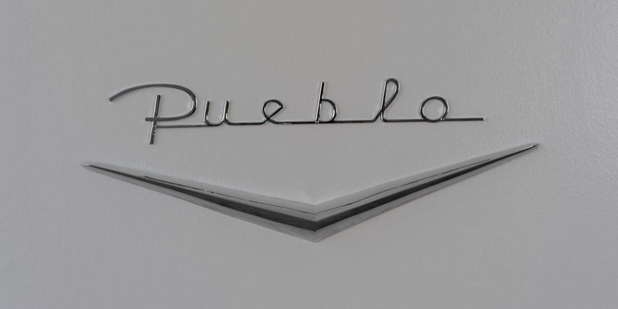
Yes, the work is made from a computer drawing. Bearing in mind that everything needs to be fabricated from scratch, the type of text has to be reconstructed. The typography of American cars no longer exists, so from the existing texts I have reconstructed the letters of each of the logos. The drawings are made into objects by a 3D printer. After, the piece is cast in bronze, then copper and chrome plated. Finally, it is painted if applicable. It is a collaboration where many disciplines intervene.
Have you done yourself the typographic work? Each piece has a different typography.
Yes, the typographies have been constructed with the old logos in mind, each emblem has a different kind of text. For the longer texts Cadillac’s typography has been used.
What place do words and forms have in this series. How do you think of their interrelation?
Yes, they are related. The V symbol signified that the car’s motor had 8 pistons in a V shape (all a symbol of power at the time). It is present in many of the phrases as a demonstration of political power and horsepower. It also makes reference to speed. The word “betrayal” appears associated with the symbol of the planet of Oldsmobile, this is also repeated in the case of “we will defeat” and ‘enemies’. The combinations can vary infinitely.
Do you prefer to talk about replicas or pastiches of emblems in your series? What is the relationship to the notion of originality?
The emblems are inverted “ready mades”. They have been fabricated from scratch, which makes them originals, however they have a narrative which is completely separate to the notion of originality. In a way, this is similar to what the revolution has done for years: “erase and retell”.
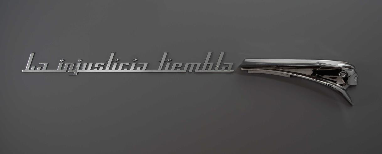
For the Injusticia tiembla you associate the slogan to an Indian head, why?
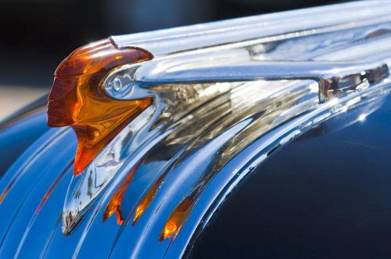
“La injusticia tiembla” is just a fragment of a longer phrase that Fidel said at the funeral of the victims of the bombing of a Cuban aircraft in Barbados in 1976. The complete phrase is: “When an energetic and virile people cries, injustice trembles”. The attack in Barbados was part of the cold war, the conflict between Cuba and the revolutionaries in Miami. It has always been said that the bombing was organized and implemented by Luis Posada Carriles. The Pontiac logo also has its story, it recalls the conflict between Europeans and Native Americans. Pontiac is the name of the Ottawa leader that faced the British in 1763.
What were your sources of graphic inspiration precisely to draw this series, in particular?
The inspiration for this series was the almost-lost world of American cars; the history of these cars and their relationship with Cuba.
It is possible to perceive in your work a DIY strategy, as if you were trying to remix the codes and forms of modernity. What do you think?
In a way yes. All of my work is an invitation to do it yourself (although many times I do not make it myself). The works are an invitation to become involved and make it a part of your home, to actively participate.
How do you imagine continuing this series?
The series should continue and include many consumer goods from the 50’s that still function. It is a work that is dedicated to resistance and memory. It also should include furniture that in some way retains the standards of commodity and glamour of the period. It is a project that can develop through design as the source of the narrative.
Does it mark an evolution in your work?
Definitely, it is not exactly a look to the future, but it is a way of finding answers and identities through investigating the past.
Does your series present the new emblems of a past revolution that you seek to endow with a graphic design or are they the emblems of today’s revolution?
It is fascinating because Cuba is a country that lives in the past, the present does not exist and nor does the future.
Do you think revolution in Cuba is over or still has a meaning?
The revolution is not dead. It is impossible to separate Cuba from its revolution, it still carries weight in the lives of Cubans.


